Community water park, NRH20, has been cooling the inhabitants of North Richland Hills, Texas for the past 21 years. When the decision was made to refresh the park’s brand identity, General Manager Frank Perez and the NRH2O team, turned to globally-renowned entertainment design company, FORREC Ltd.
Ranked #6 in TripAdvisor Travellers’ Choice Awards for USA Water Parks, it currently attracts 250, 000 guests a year.
“We were looking for a way to update the overall look of the park and bring it together under one cohesive branding scheme, ” explains Perez.
A Storytelling Approach
A key requirement was to maintain what he describes as “the history and charm of the park that our guests have come to love as they were growing up” while introducing it to a whole new generation.
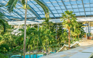
.jpg) Christopher Arnold (left), practice leader for graphics at FORREC, was the project manager who led the development of a new creative concept for NRH20 Family Water Park.
Christopher Arnold (left), practice leader for graphics at FORREC, was the project manager who led the development of a new creative concept for NRH20 Family Water Park.
He spoke to Blooloop about FORREC’s storytelling approach to the revitalisation of a much-loved brand.
Arnold studied Industrial Design at the Ontario College of Art and Design and has worked in industrial, graphic and exhibition design. One of his areas of focus and expertise is experiential graphic design, something he has been teaching as a professor for around thirteen years.
“That’s been really interesting, having both sides – the professional and the academic – to experience and learn from, ” he says.
After graduating, Arnold worked in-house at the Art Gallery of Ontario for a number of years in the exhibition design group, and then at various firms gaining experience.
“Prior to coming to FORREC, I worked as a creative director. So that’s my background in a nutshell.”
Creating A Cohesive Brand
Describing the NRH20 project as “great fun”, he says:
“They realised they needed a strong brand. They are a community park, and there are a lot of challenges – the environment is getting more competitive, there are other parks in the region, and they really needed to raise the game, to focus on their brand and the guest experience, and consider how they communicated what they were about.
“And that’s kind of where we come in. We’re really focused on how people experience places that we design.
“The park is quite established, and they do really well, competing against larger enterprises with multiple parks: there’s a Six Flags water park, and NRH20 holds its own in terms of attendance, which is impressive for a community-owned park.”
FORREC’s remit was to refresh the brand and, as Arnold explains, pull things together:
“They were finding that things were developing in a somewhat piecemeal fashion and wanted a more cohesive vision for their brand.”
FORREC’s Holistic Approach
He believes that FORREC’s holistic approach, from master planning through to implementation, made them ideally placed to deliver this cohesion.
“One of the things that we felt was important was to really tie everything together; to really focus their brand, and make it more consistent throughout the park, ” he says.
.jpg)
“We saw there were a lot of things that were good: they had a lot of brand equity in their name, they had been established for quite a while. They had developed some existing characters and were on the road to finding a strong brand.
“But it was a little bit simplistic; it could be developed further and really be brought to the next level.”
The ‘next level’ is a reimagining of NRH20 as an open-air laboratory staffed by a cast of engaging characters whose main function is to prove the formula ‘water = fun’.
FORREC’s approach was to build on existing strong elements that were already working, rather than to impose radical transformations.
.jpg) Appealing to a New Generation
Appealing to a New Generation
The park already had a resident cast of characters which, given the FORREC treatment, evolved and were rationalised and set in the context of the Texas freshwater lakes and streams.
“We took the existing characters and introduced the idea of a generational change, ” says Arnold.
The park’s signature characters, Professor Frogstein, an egghead scientist, and his evil nemesis, Doctor Unfun, had been battling it out for over two decades.
“It was a little bit binary: it was just the two strong characters, and there really wasn’t a narrative behind it that people could really understand and buy into.”
In collaboration with the park, Arnold’s team decided to create a stronger storyline, expanding the number of characters involved in this narrative, and introducing a generational shift with new, younger characters.
“Professor Frogstein now has a son, Bounder, introducing a more youthful character into the mix, and Doctor Unfun has a niece and nephew, Ebb and Flo, who are carrying the torch in terms of being mischievous and meddling in what Bounder is doing.”
The generational shift with the characters reflects the shift that is actually happening, where people who visited as children are now bringing their own children to the park.
Previously, characterisation had been a little inconsistent: some characters came from fresh water habitats such as the Texas streams, while others – including a shark – originated in the ocean.
“They didn’t really mesh together, so we tried to create a logic, ” explains Arnold. “The main character is a frog, and so is his son, Bounder, the featured character. Frogs live in fresh water, so we rooted everything in the idea of Texas fresh water lakes and streams, and started to build a narrative where these creatures belonged in the same environment. Rather than the shark we introduced an alligator, for example.”
This was, he says, the key to creating something distinctive rather than a cookie-cutter, one size fits all approach.
“It really started to grow out of what would be realistic in that environment – while it limited the creatures that we could draw on, in a way, it made it a lot more focused and realistic.”
.jpg)
A Strong Narrative and Charismatic Characters
The result is a strong narrative played out by charismatic characters that immediately helps people connect with the park’s unique identity. The potential marketing strands are self-evident, including merchandising and live shows with the characters as mascots.
The new theming will also coincide with the opening of a new big slide at the park.
While much of the revitalisation has been about making best use of the park’s existing architecture, Arnold’s team identified some areas that were key for redevelopment.
“We developed a strategy of interventions to make the most of areas which could be changed and could make the most impact.
“So there was a really strong intervention, for example, at the front entrance.
“It’s like the cover of a storybook where you look at the cover and understand what’s happening inside, and it sets the stage. We really wanted to make the entrance area a lot more fun, more interesting, a place clearly identified through what you saw, and that also served as a photo opportunity.”
The Gateway to Marketing
In this way, the entrance serves as both a gateway to the park and a gateway to marketing via social media.
“We wanted a way to keep the park looking unique and vibrant, while increasing the visibility, ” says GM Frank Perez. “What we mean by that is the park was always beautiful, but we needed more iconic photo opportunities to maximise the exposure in such areas as social media.
“With the new branding and creation of iconic photo opportunities within the park by FORREC, it will now be easily recognisable as NRH2O Family Water Park in social media posts and other platforms, thereby increasing park exposure.”

“In the front entrance we’ve used a supergraphic, ” explains Arnold. “You take a picture of yourself and your friends in front of the sign, which is a giant graphic, and that gets uploaded and it starts to become the image that people see of the park. Once those elements start to become more visible online it does start to build the brand in a very strong way.”
This is in line with the current trend of guests curating their own experience: rather than being passive participants they shape their experience and the way others see it, sharing what they have done and seen with others online, which feeds into a dialogue and makes the experience participatory.
“Beyond the increase in exposure on such platforms as social media, the new branding will aid in introducing the park to the next generation of guests, ” says Perez.
“NRH2O has always been known as a water park within a city park and we wanted to stay with that overall theme. Tying the new branding into that with Texas freshwater animals, as well as creating the new generation of water park characters, helps further the image of the park for our returning guests.
“In essence, the park characters are growing into the next generation just as the people that originally came to play and work at the park now have families of their own and are creating their own new adventures with their family at NRH2O. This will help the park remain strong with the next generation of guests, as well as attracting new ones and keeping the park financially successful for many years to come.”.jpg)
Despite the trend for VR coasters and multimedia immersive experiences, water parks are more popular than ever. FORREC is currently working on a number of them all over the world. What has become more prevalent within the sector and the attractions industry in general is the emphasis on story.
“Brand stories are something we’re beginning to see more of, ” agrees Arnold. “Obviously there are new rides and so on, and that drives interest, but there’s also a sense of a holistic view of the guest experience.
“So, there’s meaning behind the imagery that we’ve chosen; it may be explicit, it may be implied, but we’re really building this whole story around the brand, and the experience that people can expect there.”