The business of attractions, straight to your inbox!
Sign up to receive the industry’s most comprehensive news service directly to your inbox every day.
✅ Thank you! We’ve sent a confirmation email to complete your subscription.

Attraction stories


Don’t miss out
Get the latest attractions industry news direct to your inbox, every day.
✅ Thank you! We’ve sent a confirmation email to complete your subscription.
Most viewed
Day
Week
Month


Other attraction news
Why do people read blooloop?
blooloop is the world's most authoritative, widely read and trusted news source for attractions industry professionals. But don't take our word for it:
Don’t miss our
FREE daily newsletter
Get the latest attractions industry news direct to your inbox, every day.
✅ Thank you! We’ve sent a confirmation email to complete your subscription.


Become part of the blooloop community:
Events
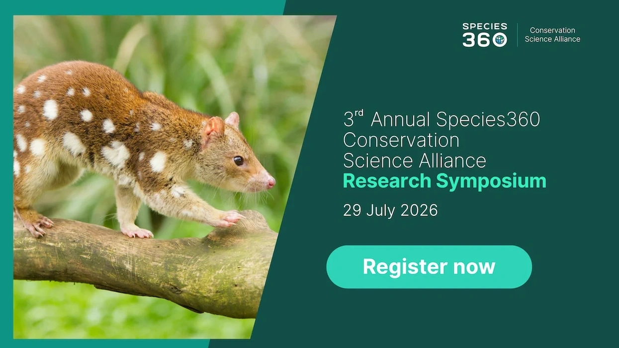
Species360 Conservation Science Alliance Research Symposium
Date: 29 Jul 2026
Location: Online

Events
PLASA Show 2026
Date: 6 Sep 2026
Location: Olympia London, Hammersmith Road, Kensington, London W14 8UX, UK
Events
Neuroplaces 2026
Date: 15 Sep 2026
Location: Protein Studios, 31 New Inn Yard, Shoreditch, London EC2A 3EY, UK
blooloop is taking climate action and is now B Corp Certified.Sustainability strategy

Become part of the blooloop community:Work with us