
When fans walk into a stadium, the screens are already speaking to them. Not quite shouting and not quite demanding attention; just setting the mood. A matchup graphic drifts across a concourse ribbon, upcoming games sit on a pillar display and sponsored content loops near the beer line.
Then everything shifts. The lights change, the music hits, and every screen in the building snaps into a new gear.
That transition from “let’s grab our seats” to “it’s game time” is one of the most important design decisions in game presentation, even if most fans never consciously notice it.
It's not one deliverable. It's a hundred
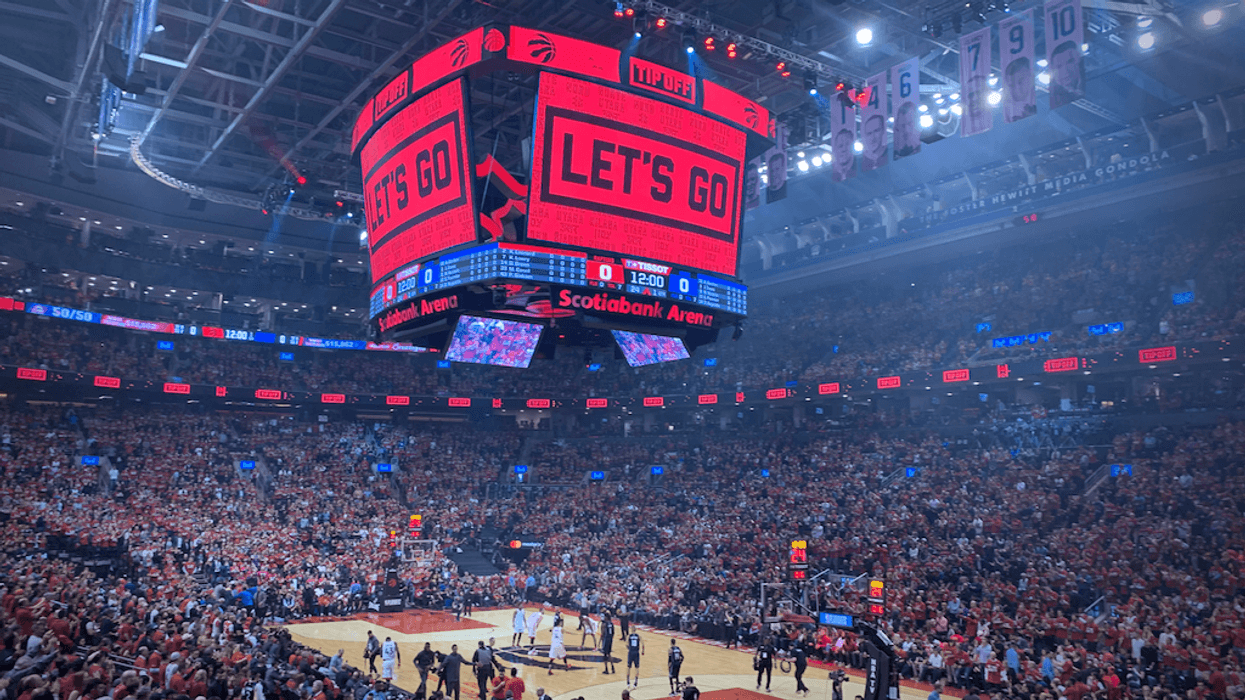
People outside the industry tend to think of stadium content as what gets played on the big hero screen. Obviously, this is the largest display in the arena, featuring elements like hype reels and game prompts.
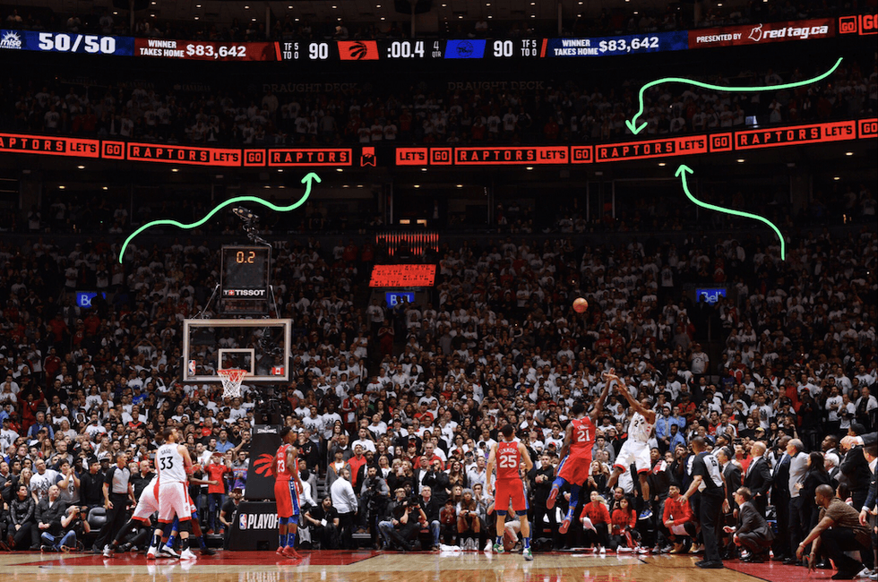 Image credit Frank Gunn, Canadian Press
But a full game presentation package for a stadium involves dozens of unique screen formats, each with its own resolution, aspect ratio, frame rate and content rules.
The spec sheet alone can run dozens of pages, featuring field-facing LED boards, concourse ribbons, pillar screens and more. Also, some screens benefit from tile-and-drift, where content scrolls off one edge and reappears on the other.
Plus, screen real estate needs to be considered, as some layouts might need to accommodate sponsor logos and player stats.
Every sport has its own rhythm
The sport itself shapes the design. Baseball has regulated breaks between innings, creating natural windows for content. Basketball runs in quarters with timeouts. Soccer keeps the clock running with almost no interruption.
Then there are the environmental constraints.
In some indoor arenas, white levels aren’t just an aesthetic choice. They’re a lighting decision since every screen acts as a light source. Push too much white, and you can shift the feel of the entire space, even impacting the game itself.
That doesn’t mean you can’t lean into high-energy visuals that light up the room. Just be intentional about when you use them, saving those moments for timeouts or pregame hype.
The brief is my game plan
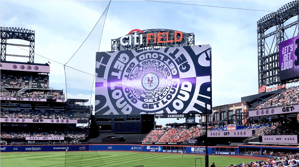
Sometimes a team comes in with a fully formed creative strategy already in place, and the Mets’ City Connect project is a perfect example.
Nike and New Era built an entire uniform system inspired by New York’s subway, using a purple-and-grey palette tied to the 7 train, which runs directly to Citi Field in Queens.
Details like bridge-patterned pinstripes and a patch inspired by vintage subway tokens make that concept tangible, giving designers a rich and cohesive world to draw from.
The animation package extended those ideas into 3D subway tokens, animated subway stops and subway tile patterns that carried across every screen format in the building.
The goal with every game presentation is variety. You can only show a logo animation so many times before fans tune it out. A deep creative concept gives you the raw material to keep surprising people across dozens of different moments and screen shapes.
Other times, the brief can be simple with only the team brand guide as a catalyst for the game presentation. Both approaches work and are not constraining at all.
I always see design guardrails as being freeing. When you only have three colours to work with, along with a handful of typefaces, you can think more inventively about the overall layout.
Designing for the people who run the show
A game presentation package isn't finished when the renders are delivered.
Rosters change constantly—players get traded, called up from the minors, or even injured. And on the rare occasion, a player's card could need updating if they were suddenly sporting a wildly different hairstyle.

The in-house production teams at these venues are making changes on the fly, even on game day, so the templates we deliver have to be editable. Type in a player's name and position, and the animation adjusts automatically.
That kind of versioning thinking is informed by broadcast advertising, where a single campaign might need dozens of format variations delivered overnight.
In sports, the same instinct applies. You're building a system that needs to be malleable.
Ten days from brief to opening day
Timelines in this space are tight. Playoff packages typically land about a month before the postseason starts. And playoff content carries a unique tension, where a first-round series might include only two home games. If your team gets swept, weeks of creative work gets shown twice and then shelved forever.
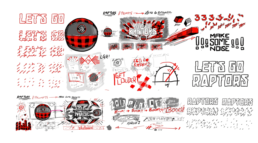
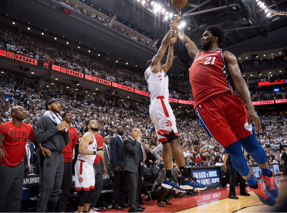 Image credit Jesse D. Garrabrant/NBAE via Getty Images
We always think about the production process strategically from day one.
For example, certain game presentation deliverables may require more levels of approval on the client side, so we strive to design those first to streamline the approval process. Getting those moving early buys time for the pieces that need more creative iteration.
The screen you carry in
Stadium technology keeps evolving.
Center-hung displays are getting more sculptural, like the massive center stack at Capital One Arena, or halo screens wrap the openings of dome stadiums. And the most interesting frontier might be the screen every fan already has in their pocket.
![]()
Some venues have already experimented with synchronized phone content that echoes what is happening on the hero screen simultaneously. Or the kind of forced-perspective activations we see in large OOH displays could also find a home in game presentations.
As the technology to deliver these experiences becomes cheaper, the creative thinking that makes them meaningful is where the real value lies.
It's a collection, not a piece
In university, I studied fashion design, and I still apply the mindset of stepping back to look at the full collection when approaching game presentations. Is everything cohesive? Does the colour story make sense? Did I lean too heavily on one idea?
Each piece of content needs to stand on its own, but it also has to work in concert with every other screen in the building.
Because in the end, a great game presentation isn’t about any single moment. It’s about how all of those moments come together to shape the experience from the second fans walk in to the final whistle.
When it all works, the design disappears into the energy of the game itself, guiding emotion, building anticipation and making the entire night feel bigger than the sum of its parts.
Images courtesy of Nice Shoes.
