
Data visualization is an essential–and increasingly popular– tool for businesses. But built into its name is the easy misconception that it’s only about seeing data in novel ways–i.e., not in a spreadsheet. Even with the most beautiful graphics, these deliverables fail to realize the transformative power of immersive experience design.
Instead, organizations must take a story-first approach to data visualization. That means starting with a firm understanding of all the different stories their data can tell, then strategically creating visualizations that drive the results they’re looking for.
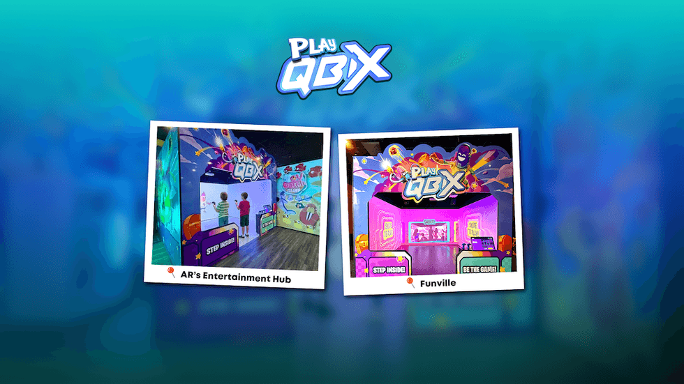
Equal parts analysis and collaborative creativity, this work transforms information into interactive systems for meaningful exploration, targeted problem-solving, and memorable experiences.
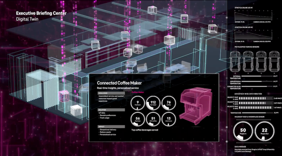
For example, programmatic visualization frameworks that combine real-time and archival data to tell a story about long-term impact, or sensor data-driven digital twins that tell an easy-to-digest story about how complex systems function.
Expected outcomes from a story-first approach
Here are some of the outcomes organizations can expect from a story-first data visualization framework:
Differentiation
In crowded sectors, showing how clients use their data helps them stand out. Visualizations pull the curtain back on how an organization thinks, which goes a long way to communicate its unique taste and style.
Decision-making
The best data visualizations invite active exploration of patterns that fuel engaged, responsive next-step thinking. Gaming out ideas in virtual environments removes stakes in a way that inspires creativity and out-of-the box ideas.
Personalization
Data filter layers can easily and quickly reconfigure data sets for different audiences. User-controlled layers engage active participation for different groups.
Inspiration
Beautiful, big-picture visualizations inspire blue-sky thinking by painting a picture of what’s possible. AI-assisted prompts can ignite thought-provoking connections and advance ideas.

An organization's data is like its tarot deck, magic 8 ball, atlas, compass, and map all rolled into one. And it’s hugely valuable–interpreted the right way, it can demystify complex patterns, reveal hidden truths, and plot a path forward.
Smart organizations realize the level of investment in data visualizations must match the long-term value they’ll extract from these activations.